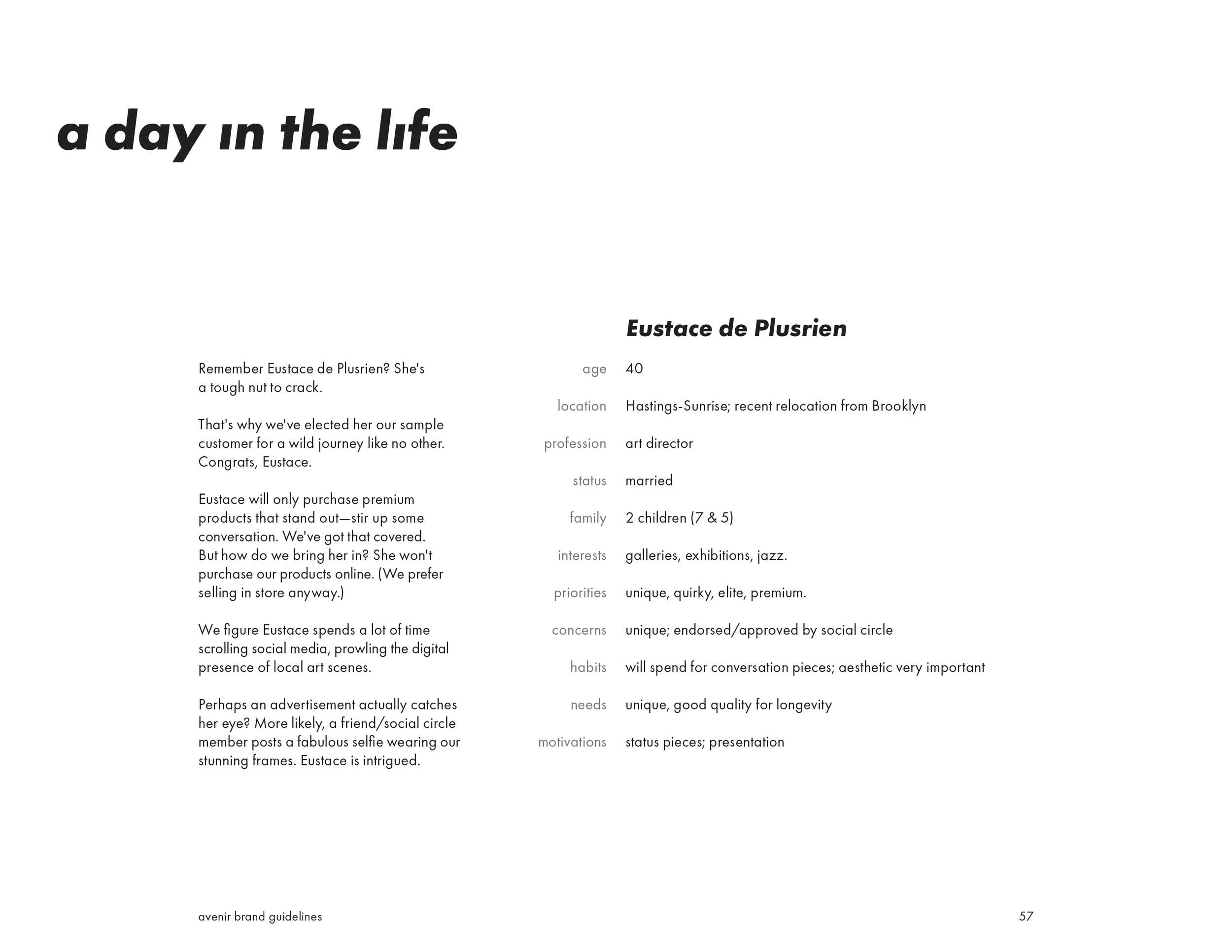
avenir brand identity
a complete brand identity & guidelines project for a fictional boutique eyewear brand for BCIT’s Brand Identity course. a deep dive into grid systems & typographical hierarchy.
logos, typography, colour, photography, graphic elements, physical applications & experiential design.
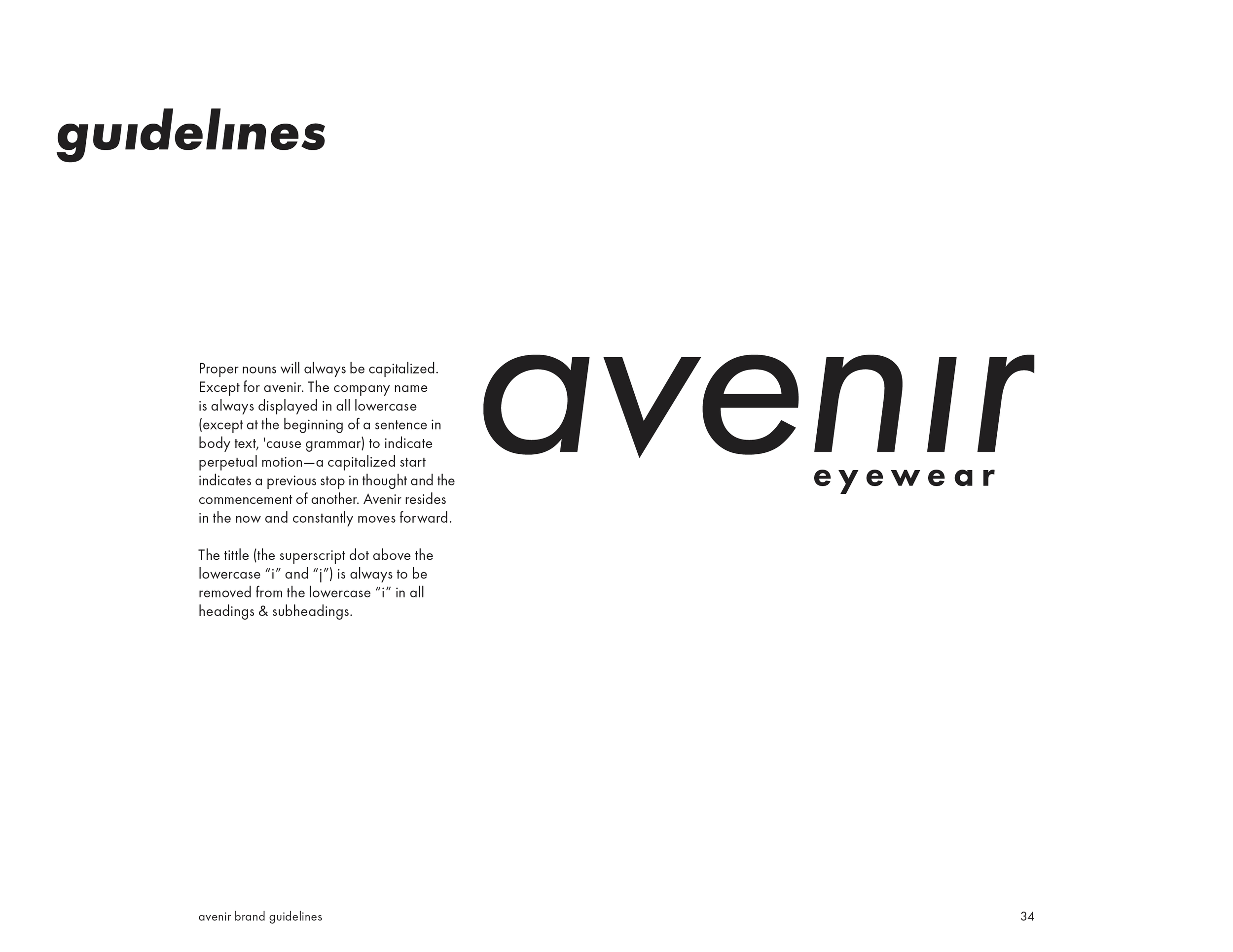
avenir eyewear
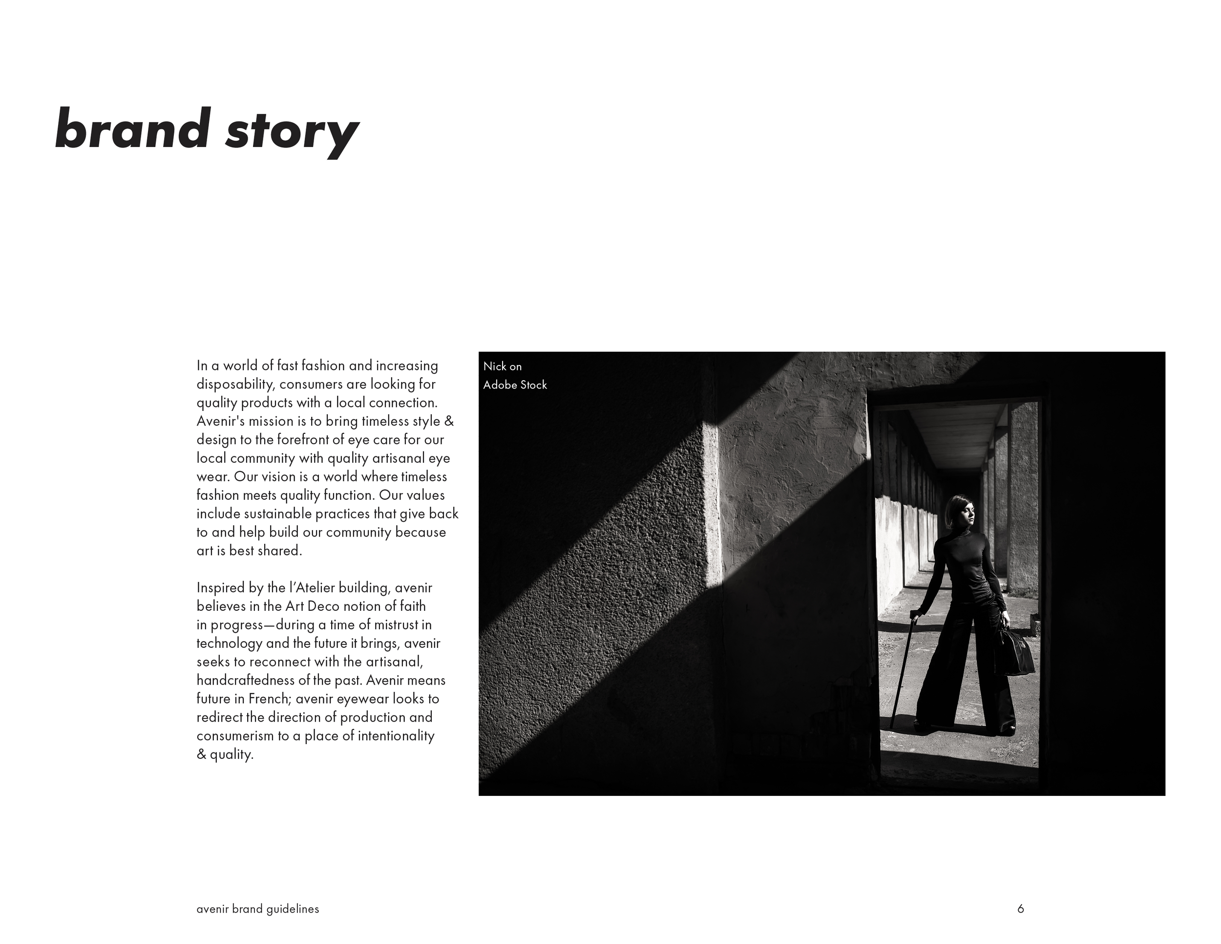
Avenir's mission is to bring timeless style & design to the forefront of eye care for our local community with quality artisanal eye wear. Our vision is a world where timeless fashion meets quality function. The avenir values include sustainable practices that give back to and help build our community because art is best shared.
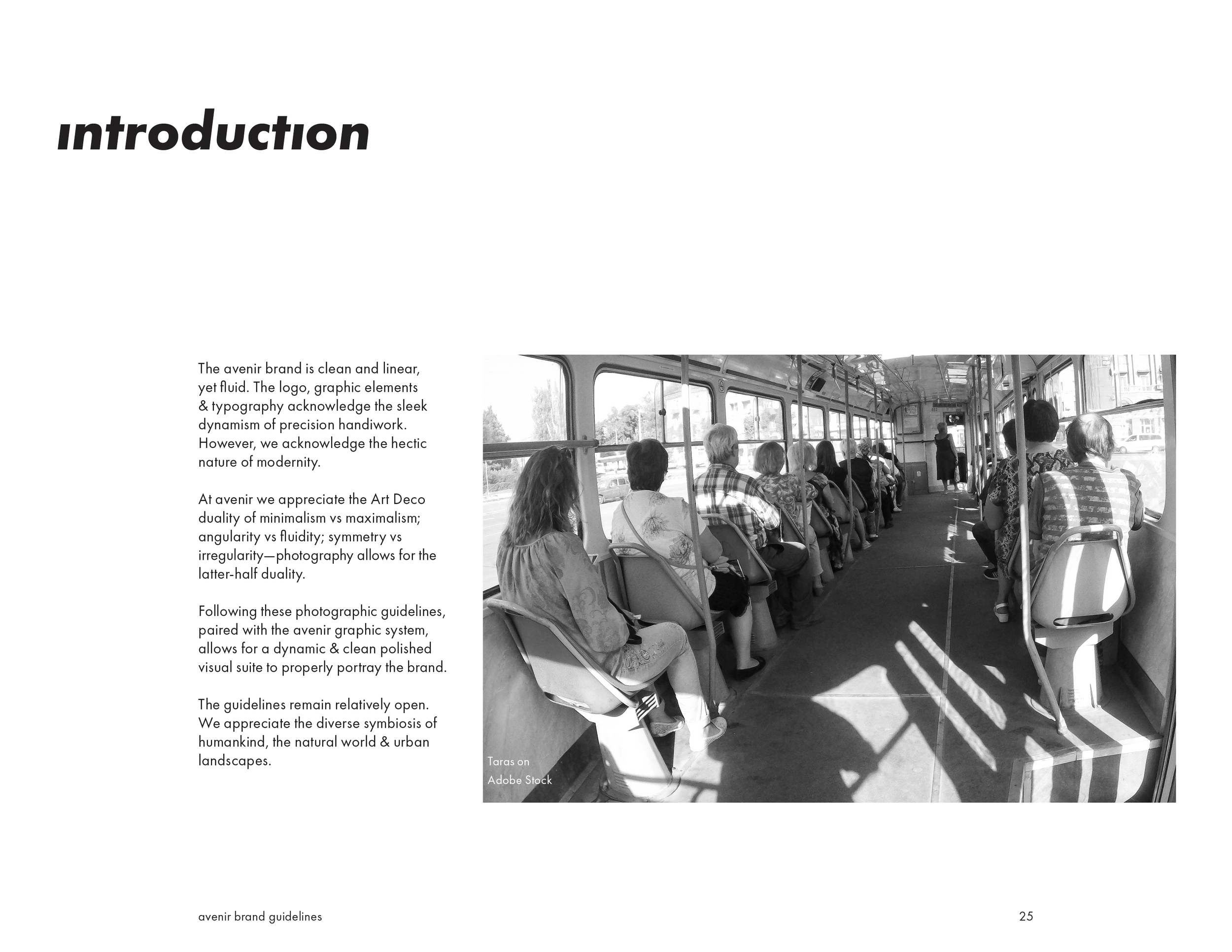
Inspired by the l'Atelier building, avenir believes in the Art Deco notion of faith in progress—during a time of mistrust in technology and the future it brings, avenir seeks to reconnect with the artisanal, handcraftedness of the past.
Avenir means future in French; avenir eyewear looks to redirect the direction of production and consumerism to a place of intentionality & quality.
BCIT Brand Identity
2025
logo process
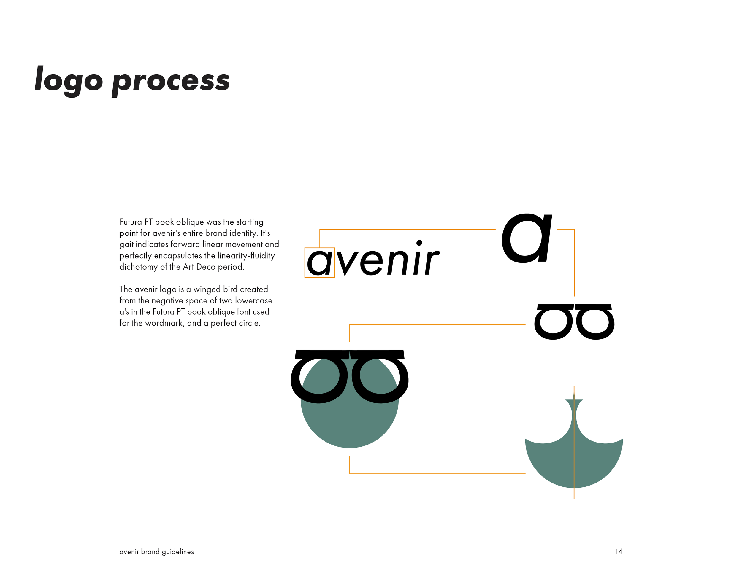
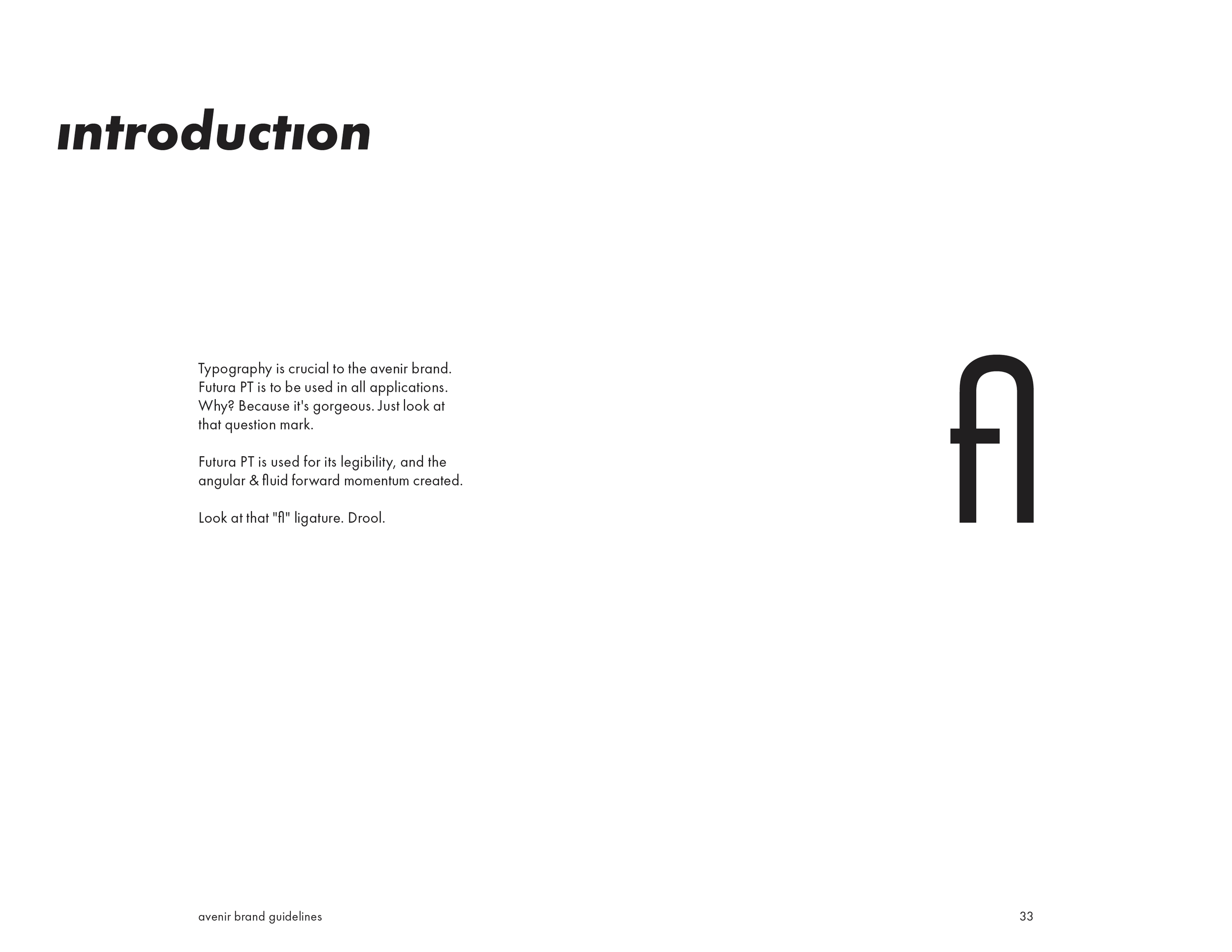
Futura PT book oblique was the starting point for avenir's entire brand identity. It's gait indicates forward linear movement and perfectly encapsulates the linearity-fluidity dichotomy of the Art Deco period.
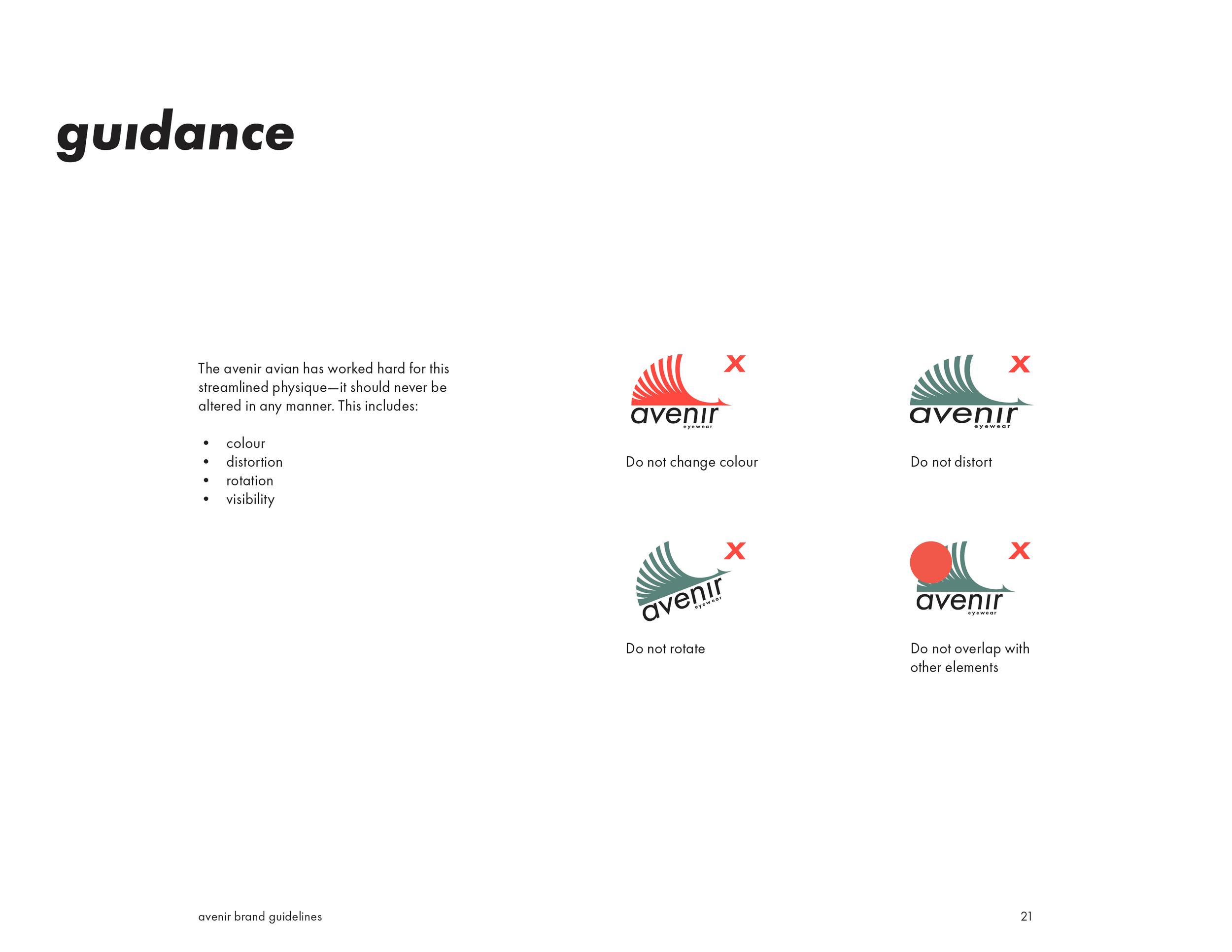
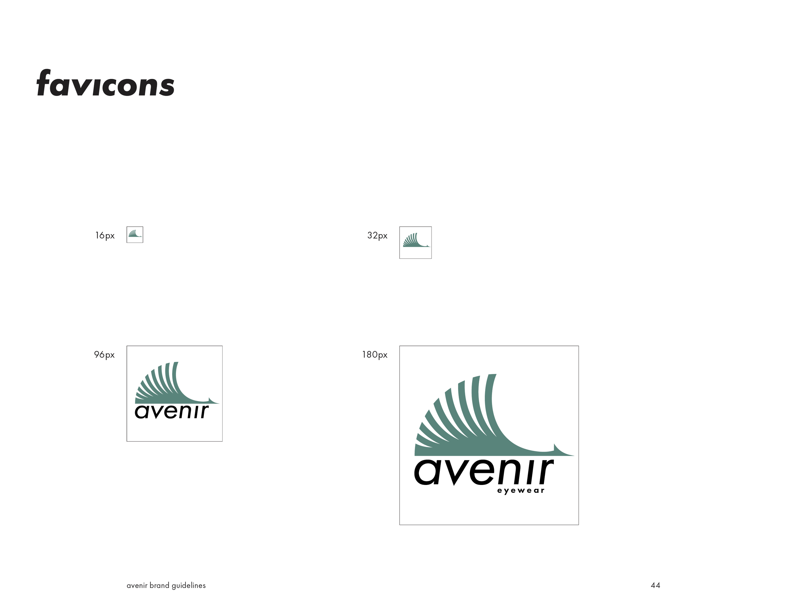
The avenir logo is a winged bird created from the negative space of two lowercase a's in the Futura PT book oblique font used for the wordmark, and a perfect circle.
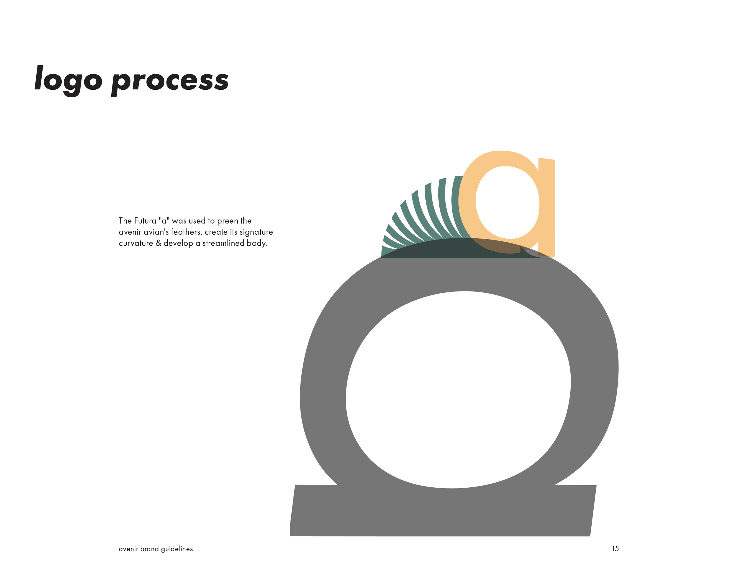
The Futura "a" was used to preen the avenir avian's feathers, create its signature curvature & develop a streamlined body.
logo system
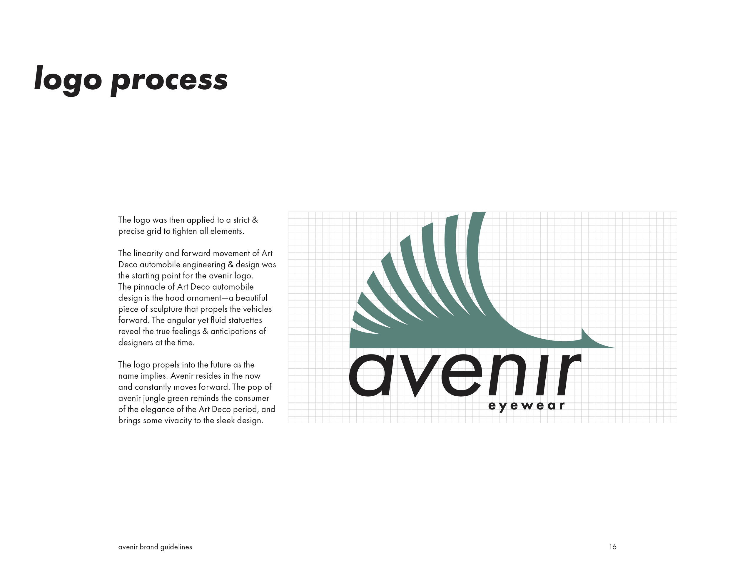
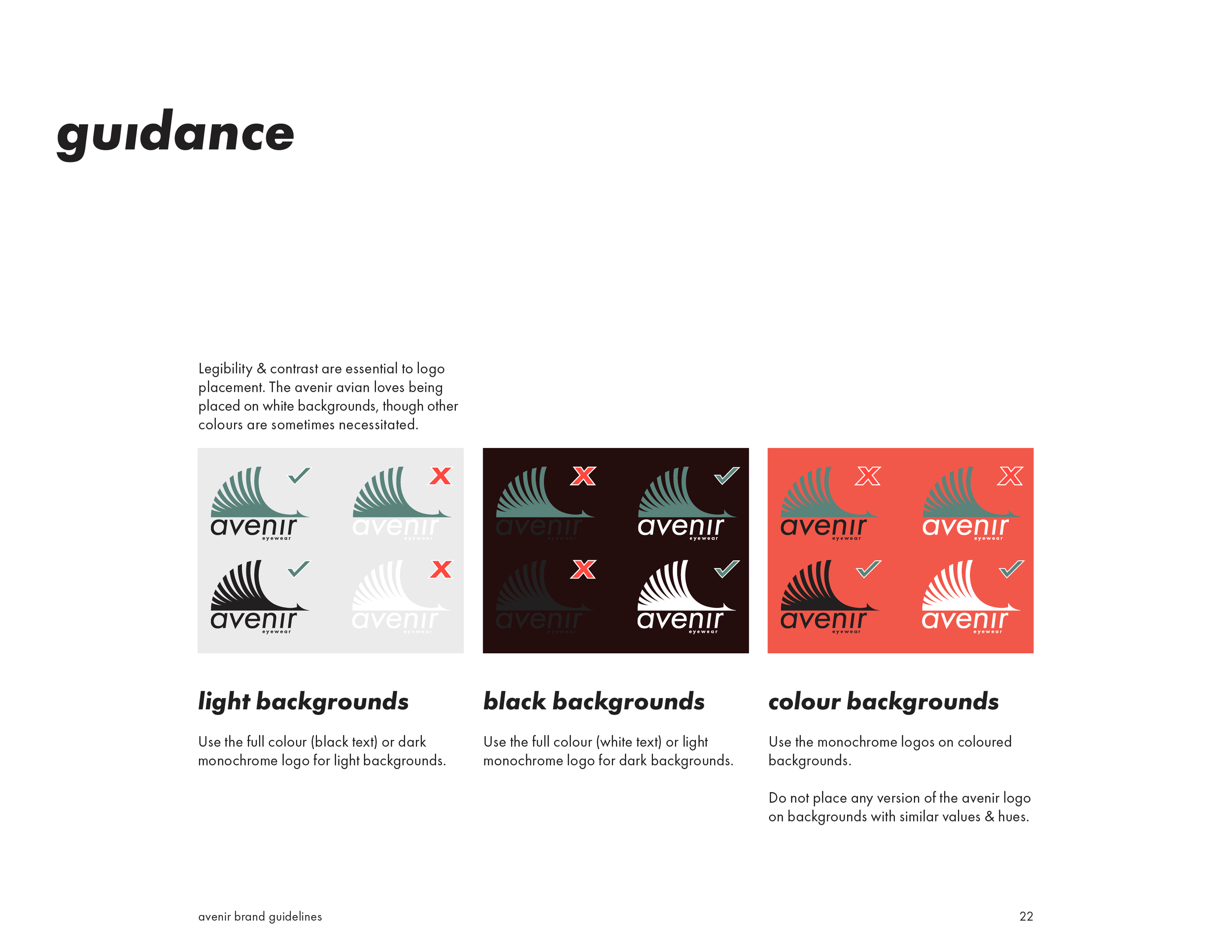
The logo was then applied to a strict & precise grid to tighten all elements.
The linearity and forward movement of Art Deco automobile engineering & design was the starting point for the avenir logo.
The pinnacle of Art Deco automobile design is the hood ornament—a beautiful piece of sculpture that propels the vehicles forward. The angular yet fluid statuettes reveal the true feelings & anticipations of designers at the time.
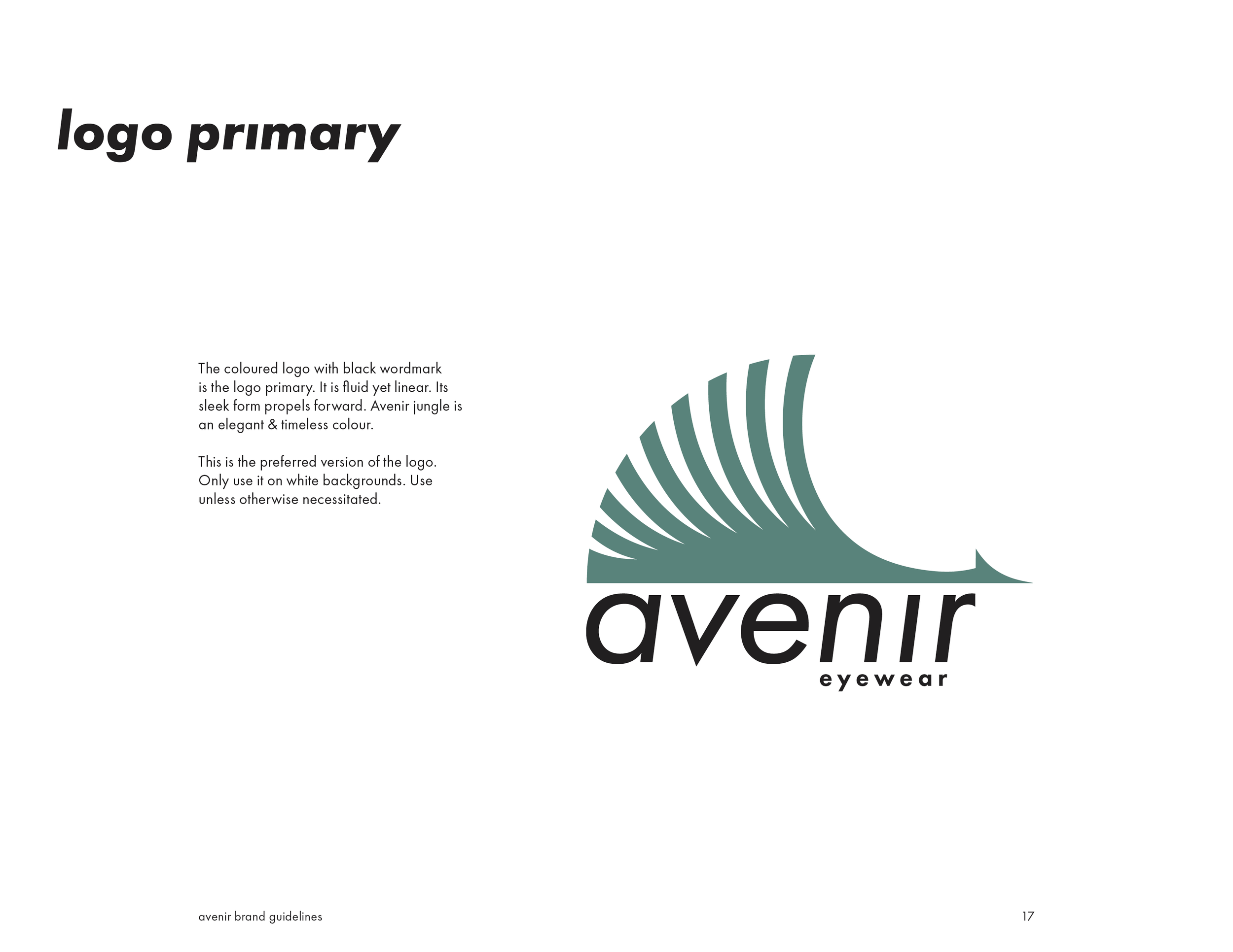
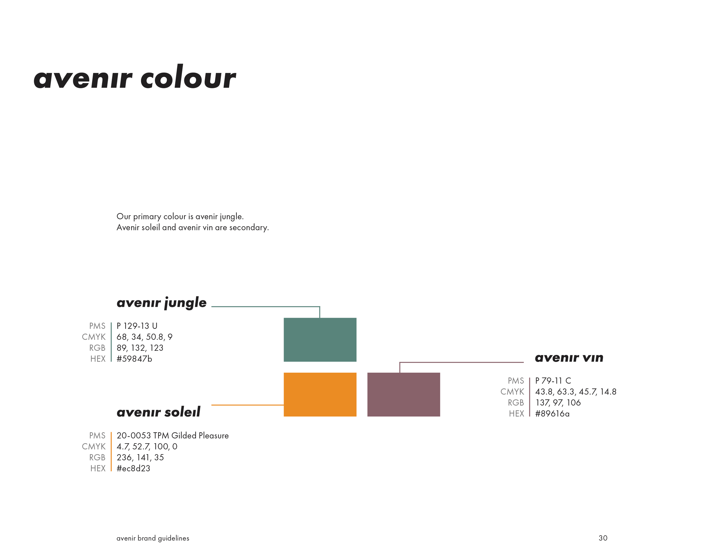
The logo propels into the future as the name implies. Avenir resides in the now and constantly moves forward. The pop of avenir jungle green reminds the consumer of the elegance of the Art Deco period, and brings some vivacity to the sleek design.